
STUDIO REKLA.M, 2026
Branding
Branding
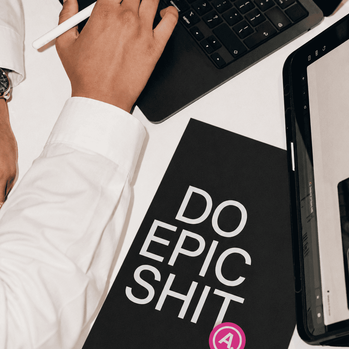
Just like any "serious" corporate agency, Studio REKLA.M needs its own branding. So, we designed a visual identity that is young, smart, and a little loud.
The foundation of our brand is clean black and white, but every team member has their own bright, bold signature color applied across the branding.
Our logo icon A. mimics a classic patent or trademark mark. Which we don't have (yet).
You will notice a dot after the letter A in our main titles. This is an inside joke and a tribute to our lecturer Anneke, who always signs her emails with a simple "A."
We tie the brand together with our colorful stickers.


next work
next work


2026 studio REKLA.M
2026 studio REKLA.M